Create the Charts
Back to: Display Survey Results with GFChart and GravityView
License Note
This lesson requires a GFChart Basic License (or a GFChart All License to change the chart colors or order of responses).
Pie Chart
Let’s start by creating a pie chart. Once GFChart is installed, you’ll see an option added to your Forms menu in the Admin sidebar called Charts/Calculations.
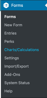
Click that option, then click the Add New button at the very top of the screen.

Give your chart a title and choose your source form.
Choose the pie chart type:
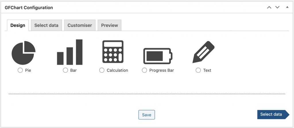
Next choose which style and legend options meet your needs. (I chose Default style and Labeled Legend.)

Then click the arrow to Select data.
In this simple chart, I only need to select the field that I want to display, but the chart builder provides options for filtering the data by logged-in user, by date range, or by additional filters (which works like conditional logic on your form).
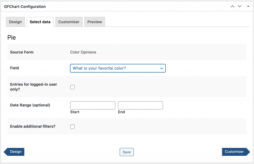
When you’ve set all the correct filters, click the right arrow to the Customizer.
Here you can set a chart title, specify the height and width, choose whether the chart is responsive, and add any custom code you’d like.
I prefer to preview the chart then come back to this tab and make adjustments as necessary, so let’s click the right arrow to Preview.
This is what my chart looks like without any customizations:
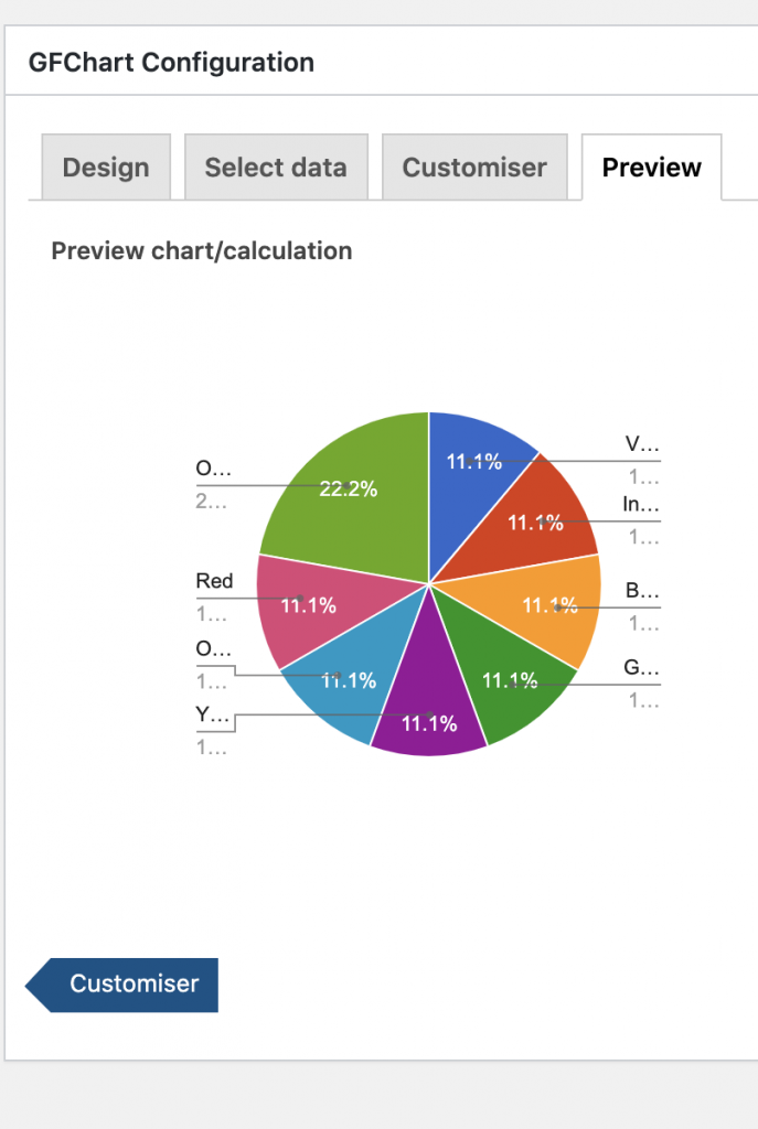
I’ll need to go back to the Customizer and make my chart wider so that I can read the labels.
Changing the chart width to 500 is sufficient to see all the labels:
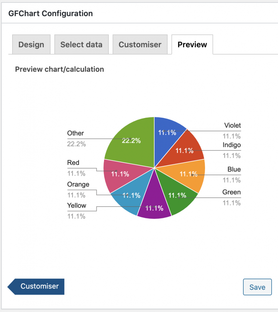
Since my responses are colors, the chart looks really mismatched with the orange label pointing to a blue pie slice, and blue pointing to yellow. With the Survey Customizer, an add-on available with the GFChart All License, you’ll have the ability to change the colors so they match up with the answers.
Once the Survey Customizer add-on plugin is installed, you’ll need to update the chart in order to see the additional customization options.

Now you’ll see new options at the bottom of the Customizer tab, where you can individually select a color for each of your pie slices. Clicking on the Select Color button will pull up the color picker.
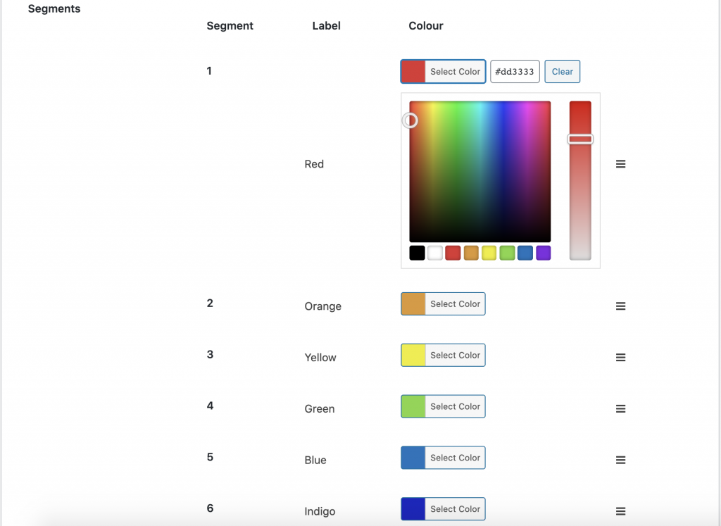
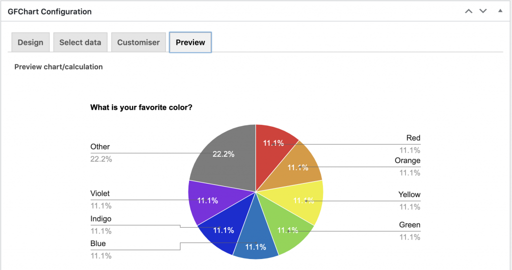
Now the preview better matches the labels:
Bar Chart
The bar chart setup is very similar.
First, name your chart and choose your source form.
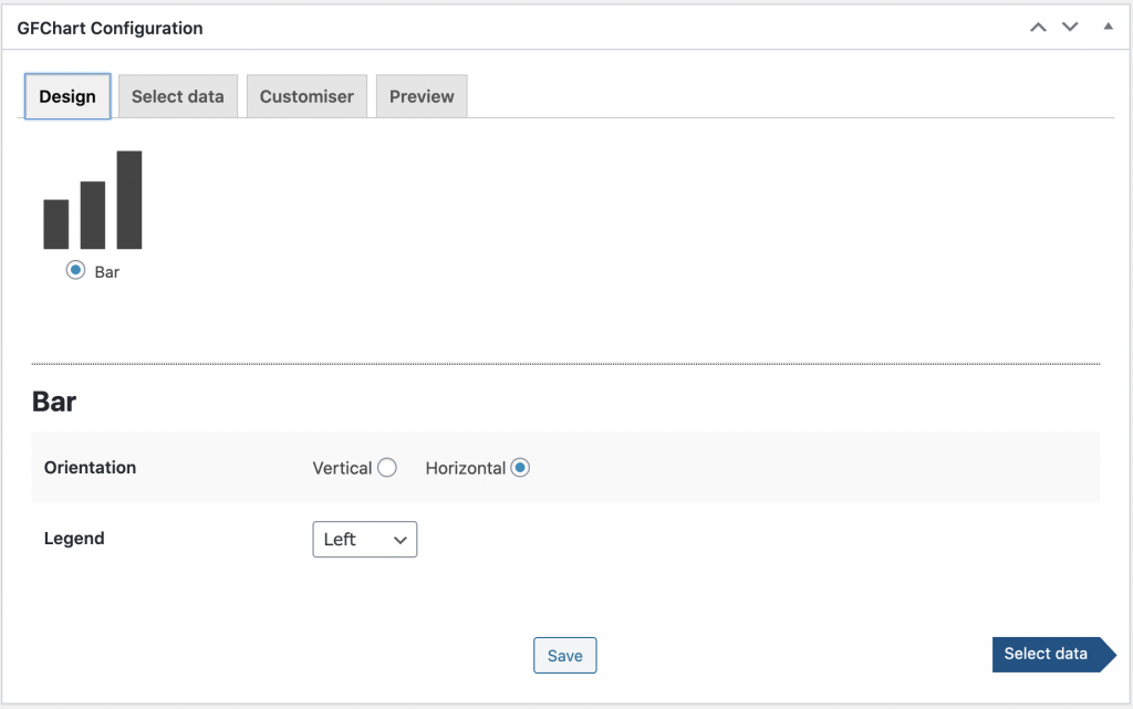
Next, select the bar chart, choose a vertical or horizontal layout and select a legend option. (I chose Horizontal Orientation and added a Legend on the Left.)
On the Select Data tab, you’ll have a number of options for your formatting. Note that the bar chart is automatically alphabetized either by Label or Value. You can customize the order, as well as change the color of the bars, with the Survey Customizer add-on.
Once you’ve selected the sorting and filtering options that meet your needs, click on the right arrow to go to the Customizer tab. This is almost identical to the Customizer tab for the pie chart, with the addition of optional horizontal and vertical axis labels. Again, I’ll skip ahead to the Preview tab and then come back to make adjustments as needed.
Out of the box all of the bars are blue and they are listed in alphabetical order (either ascending or descending, depending on your choice on the Select Data tab).
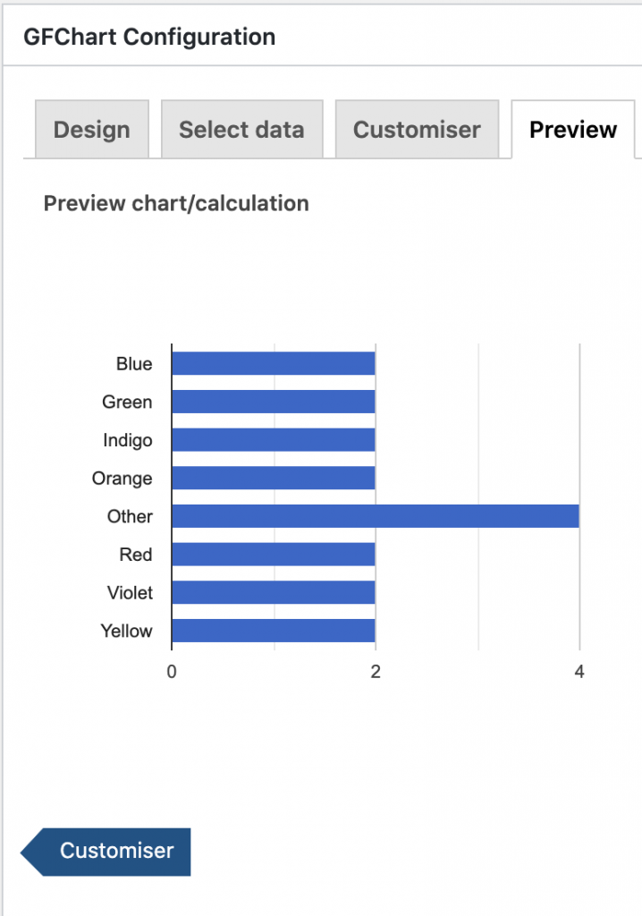
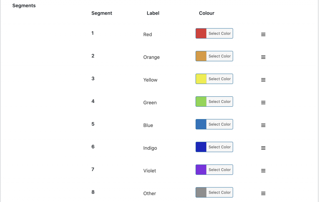
To make this more colorful and arranged in my preferred order, I’ll make use of the Survey Customizer add-on. In order for the additional options to appear on the Customizer tab, you’ll need to update your chart.
I’ll select my colors just as I did in the pie chart setup. To change the order, click and hold the 3 bars on the right of the segment you want to move, then drag it into the correct order.
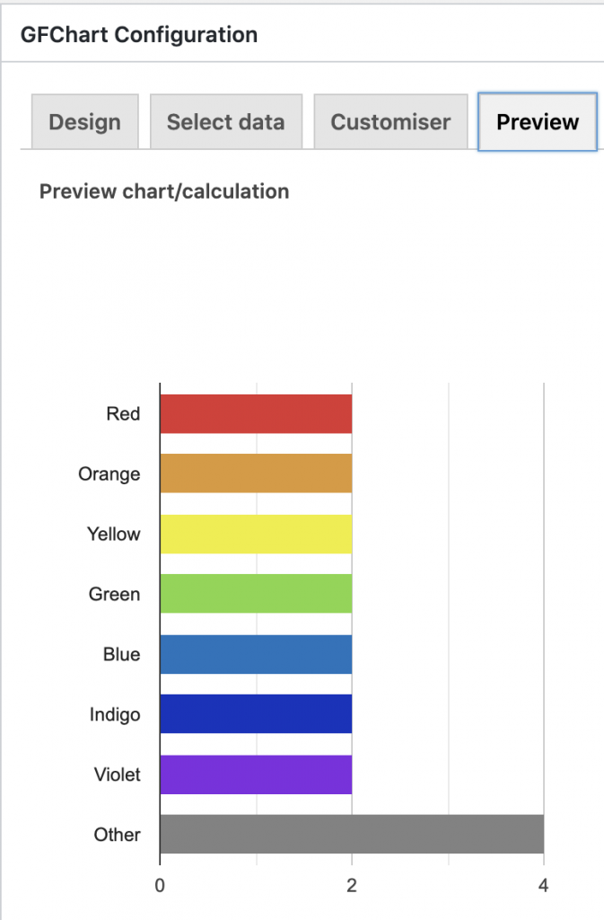
After making the color and order adjustments and increasing the height of the chart to 500, the final version looks like this:
Embed Your GFChart on a Page
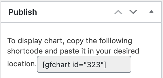
Now that you’ve completed your chart, you can embed it on a page. Simply copy the shortcode to the right and paste that in a shortcode block on your site.
In the next lesson, we will create a GravityView to show the free form answers.
