DIY Layout
Back to: DIY Layout
Licensing Note
DIY Layout is available with a GravityView All Access License.
To install the DIY Layout Extension, go to Extensions under the Views menu in the Admin sidebar. Find DIY Layout and Install and Activate the extension.
Multiple Entries
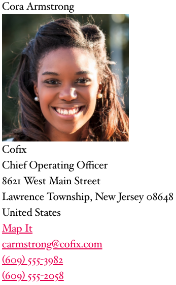
Out of the box, DIY View is very plain. This is intentional to allow you to create the styling that works for you. This is what it looks like:

The field settings allow for some styling without needing to use HTML or CSS. Select the gear icon next to the name field and change the container tag to invoke your theme’s styling of the HTML elements.
Here are the fields in this layout and the CSS Class names I’ve added:
- Name (CSS Class: member-name)
- Headshot (CSS Class: gv-muliple-image)
- Company Name (CSS Class: company-name)
- Job Title (CSS Class: job-title)
- Address (CSS Class: company-address)
- Office Phone
- Mobile Phone
- Edit Entry (CSS Class: update-link)
We need to make a few additional field settings updates:
Headshot: set Custom Width to 200 to reduce the size of the image
Address: uncheck Show Map Link
Office Phone and Mobile Phone: in the Before Output field add “<b>O</b> ” and “<b>M</b> ” respectively. This will add the bold O and M before the phone numbers with a space between.
Edit Entry: change Edit Link Text to “Update Profile”
Like in the original View, don’t forget to restrict the visibility of the contact information fields to only logged in users.
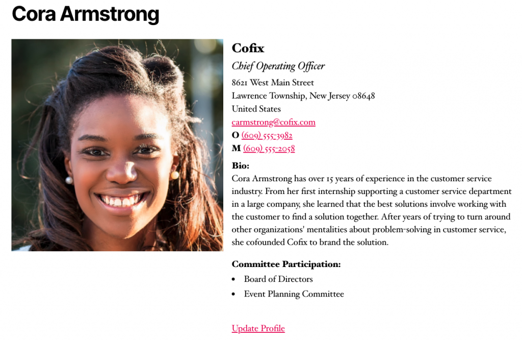
Here is the end result:

Now let’s add some Custom CSS to create this layout. Where do you add Custom CSS to your site?
CSS Styling
Your theme settings will dictate the styling of your DIY Layout View. You may need to tweak the styling listed below. Watch the video for a more detailed explanation.
The code below is applied to theme Twenty Twenty with default styling intact.
Start by expanding the View to cover the full width of the page and creating a flex container for the entries:
.gv-diy-container{
  max-width:100% !important;
  display:flex;
  flex-wrap: wrap;
  flex: 1 0 auto;
  justify-content: space-around;
}
Here are some helpful resources for learning more about Flexbox:
https://css-tricks.com/snippets/css/a-guide-to-flexbox/ (a very thorough and illustrated explanation of all the parameters of flexbox)
https://flexboxfroggy.com/ (a fun game to learn the parameters of flexbox)
Next change the font size and set a minimum width for the entries:
.gv-diy-multiple-container .gv-diy-view{
  font-size: 18px;
  min-width: 450px;
}
The font size seemed a necessity because the fonts in Twenty Twenty are big, but your theme’s default font size may be acceptable.
Once your entries are set up, you may need to tweak the min-width value to be larger or smaller depending on the width of your entries. Flexbox’s default is to show all entries on one line, so it makes them as narrow as possible unless you specify otherwise. Setting a min-width value ensures that your entry will not go too narrow even when the screen size changes. I chose the min-width value based on the widest email address in my entries. You’ll see that some of the states and zip codes flow to an additional line in the address field, but the email addresses remain intact. You can set your min-width wider if you want to keep the states and zip codes on the same line too.
Next style the name of the member:
.member-name{
  font-weight:bold;
  font-size:25px;
}
You can try changing the container tag in the field settings to H2 if your theme uses smaller font sizes and less white space. This would be better for SEO and Accessibility. That would look like this in the field settings:

Next, let’s move the headshot to the left and the text to the right:
.gv-multiple-image{
  float:left;
  padding-right: 10px;
  padding-bottom: 50px;
}
The bottom padding clears the space beneath the image so that the text doesn’t wrap around beneath the image. It also adds a buffer between rows. If your text entries are longer, you will want to make the padding-bottom value larger.
Next, we’ll make the company name bold and job title italic.
.company-name{
  font-weight:600;
}

.job-title{
  font-style:italic;
}
Then, reduce the line height of the address so that it appears grouped together:
.company-address{
  line-height: 1.2em;
}
This is theme specific, so you may want to play around with this number or add a few pixels of top and bottom padding to set the address apart.
Finally, set the Update Profile link slightly apart from the rest of the entry by adding a little top padding.
.update-link{
  padding-top:10px;
}
Single Entry
In the single entry, we’ll add in the fields that weren’t displayed on the Multiple Entries screen. Here is what it will look like:

Here are the fields with their HTML Container Tags and CSS Classes:
- Name (Container Tag: H2)
- Headshot (CSS Class: gv-single-image)
- Company Name (CSS Class: single-company-name)
- Job Title (CSS Class: single-job-title)
- Address
- Office Phone
- Mobile Phone
- 100 Word Bio (CSS Class: single-bio)
- Committee Participation (CSS Class: committee-participation)
Like in Multiple Entries, we need to make a few additional changes to the field settings:
Address: uncheck Show Map Link
Office Phone and Mobile Phone: in the Before Output field add “<b>O</b> ” and “<b>M</b> ” respectively. This will add the bold O and M before the phone numbers with a space between.
100 Word Bio: in the Before Output field add “<b>Bio:</b><br>” to add a label above the bio text.
Committee Participation: “<b>Committee Participation:</b><br>” to add a label above the committee list.
Edit Entry: change Edit Link Text to “Update Profile”
Also as with Multiple Entries, don’t forget to restrict the visibility of the contact information fields to only logged in users.
Finally, a few more lines of CSS to style the single entry:
First style the headshot by making it smaller, moving it to the left, adding a small clear space between the image and the text on the right, and adding the clear space:
.gv-single-image img{
   width: 500px;
   height: auto;
   float: left;
   margin-right: 20px;
   margin-bottom: 270px
}
Next, style the company name and job title fields:
.single-company-name{
  font-weight: bold;
  font-size: 30px;
}

.single-job-title{
  font-style: italic;
  font-size: 25px;
  padding-bottom: 5px;
}
Add a small space above the bio:
.single-bio{
  padding-top: 10px;
}
Finally, align the bullet points for the committees under the Committee Participation heading:
.committee-participation ul{
  list-style-position: inside;
}
Now your DIY Layout is styled! Below is the full code block so you can copy and paste.
Full Code Block
/****Member Directory GravityView Layout from Gravity.Guide****/
/*Set View to 100% width and create flex container*/
.gv-diy-container{
  max-width: 100% !important;
  display: flex;
  flex-wrap: wrap;
  flex: 1 0 auto;
  justify-content: space-around;
}

/*Modify font size and set min width for entries*/
.gv-diy-multiple-container .gv-diy-view{
  font-size: 18px;
  min-width: 450px;
}

/*make member name bold and large*/
.member-name{
  font-weight: bold;
  font-size: 25px;
}

/*set headshot to the left of text with small blank space before text, ensure
all text stays to right with bottom padding*/
.gv-multiple-image{
  float:left;
  padding-right: 10px;
  padding-bottom: 50px;
}

/*make company name bold*/
.company-name{
  font-weight: 600;
}

/*make job title italic*/
.job-title{
  font-style: italic;
}

/*reduce line height so company address appears grouped together*/
.company-address{
  line-height: 1.2em;
}

/*set update profile link apart from contact information with a little padding*/
.update-link{
  padding-top: 10px;
}

/*adjust the size of the image, move it to the left with a small blank space
before the text on the right, clear the space beneath the image with padding*/
.gv-single-image img{
   width: 500px;
   height: auto;
   float: left;
   margin-right: 20px;
   margin-bottom: 270px
}

/*enlarge and bold the company name*/
.single-company-name{
  font-weight: bold;
  font-size: 30px;
}

/*enlarge and italicize the job title and add a small space below*/
.single-job-title{
  font-style: italic;
  font-size: 25px;
  padding-bottom: 5px;
}

/*add a small space above the bio*/
.single-bio{
  padding-top: 10px;
}

/*line up the bullet points below the committee participation heading*/
.committee-participation ul{
  list-style-position: inside;
}